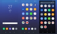
Galaxy S8 interface revealed: a new minimalist look for Samsung Comments
- d
- P@Y
apple fanboys, Samsung haters, no matter what you say , this ugly thing will still sell like f hotcakes.
- Anonymous
- 7Ac
The UI on Chinese phones look 100x better than this haha
- Shadow Snypa786
- m56
I have to admit it looks very stylish, alot more interesting and cool looking than stock android. Even Apples icons are boring.
- Anonymous
- 7Ac
Didn't think their UI can get any uglier. My goodness.
- Humxa
- 6QN
I don't understand why every company is changing it's icon style to circular. Though is looks good but not every one should do it.Develop something unique that would make you remarkable and would make you able to stand among top notch tech companies. Copying from others is not an answer to make business. Get some creativity like the icon style should be random, depending on the app type it should constitute the shape of its logo automatically or should be a 3D icon !
- And roid
- D01
TouchWiz always lags even they make beautiful skin or make it creative
- ATrain
- bY5
You can change icons as easily as wallpapers...either use the theme store or an app like Zedge that allows you to reassign tons of icons for all of the common apps to anything you want. Easy fix...
- Anonymous
- p2y
Wasted spaces. 2:1 is not meant to be used in portrait mode. It looks weird. I hope this aspect ratio does not become the new trend. I can't stand another aspect change, 4:3 to 16:9 was painfully slow.
- Julliard
- RIE
Beautiful. Minimalist design is very good. No more Touchwiz skin. Happy to see Samsung Experience skin on this device. Those who dont like it can always change it from the theme store. No worries. Though, I do wonder if third party launcher can work on this 18:9 ratio.

- AnonD-632062
- Hxc
I really don't like this UI. I'm all for minimalist design (like that on Nexus & Pixel) but I don't like the broken-lines used for the icons.
Also what's with the lack of text?? Are people now so lazy that they can't even bother to read?
- Anonymous
- 7ke
I don't know why Google replaced that great holo theme with the childish material design
- AnonD-81566
- iiW
AnonD-270570, 14 Mar 2017Do you know about the Samsung themes store? If there are free theme available, as you say, in a theme store, then people need not complain so much. Just change the icon set :-)
- Someone Else
- tZj
Based on the leaks, I really hope Samsung ditch the app drawer, or atleast make an option to disable it. It can be confusing at times.
- AnonD-18780
- gMJ
Looks interesting!
- AnonD-652683
- yy4
Looks like Xiaomi UI.
- AnonD-390711
- mqS
Like it,reminds me of the old Nokia N9 interface which was one of the sexiest ever made.
- Arian Adler
- JK1
Anonymous, 14 Mar 2017Why are you still complaining? Samsung has a theme engine
You can change it anytime
As if Go... moreAccording to I Am the Pretty Thing That Lives in the House \0/ you r right again!
One world: GS8 interface & icons r not good
Tip us
1.7m 126k
RSS
EV
Merch
Log in I forgot my password Sign up