Two new alleged images of the Samsung Galaxy F leak Comments
- Let's Go
- IaH
Funti, 09 Jun 2014Samsung really needs 2 do sometin about d designs of deir phone. Its getin boringYou (or should that be ewe) have to laugh when instead of using the Enlish language as complex as it already is, U complain about SamSINGED (past tense get it) lack of a different design
So before touch screen became the norm when numeric keypads ruled the NUMBER one for phone design was Nokia
I believe they started out with a shape in mind and fitted in a phone inside
Phones are not going to deviate that much, it is the whole package and specs.
I fell in love with the SGS 2 the original SGS 1 nothing
So whilst Samsung is now catering for phones that make us all susceptible to Magnetos influence, with this F, a metallic tweaked S5 this will NOT remove phone cases
I Bought the Nokia E6 metallic and admittedly it feels nice in the hand but the reason why it still looks good is the "PLASTIC!" S-line case I use
IMO there is nothing worse thatn a scuffed beaten up looking premium phone, so when you see an iPhone without a case it is at a distance
use this phone for a week without a case and you will regreat it
- cuadralord
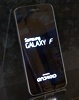
this is weird , why it says just galaxy f ....and no model number
- AnonD-272317
- uuk
Revolutionary design by Samsung!!! Loollz
- Manan1428
- KZ8
What is special features of the galaxy F?
- AnonD-212435
- nFR
This Galaxy F looks cool, look at thos bezels , it has 5.2 inch screen 2k, metal frame , metal removable back cover.
- AnonD-272298
- t}d
again same desing samsung.... i m just bored with this design. change it samsung bring another design.
- mortuus
- Tu2
wow it looks really strange.
- google lover
- t}e
Just hope samsung releases snapdragon version internationally with this line up coz then it would be awesome in sales grabing insane number of customers... It would be like icing on cake :)
- D90
- 0BI
The back looks plastic to me unfortunately.
- Anonymous
- MD@
finally edge to edge display..at least in the width.
- AnonD-168372
- vpH
This could be my next phone. I will pick usefulness than design.
- AnonD-106654
- 3sE
Galaxy'fake'prime
- unknown
- B}X
at the first image the empty space between "galaxy" an "F" is very unusual.and the position and form of the bottom key is like others samsungs phones,that it`s Unlikely to be used for the supernatural smartphone.
- Abdul Jakol
- HBE
Ugly and nothing new for samsung android.
- AnonD-159082
- 49x
Same design over and over with different names, and Samsung think we r fools.
- Anonymous
- IaH
Beware Copy King, 09 Jun 2014iPhone uses same design for 2 years running.. so samsung have no idea how to upgrade their des... morePlease don't say this. Samsung fans are going to be very defensive.
- Beware Copy King
- PGX
AnonD-149939, 09 Jun 2014looks fake to me, letter F, is running away. but i aint complaining. its high time for fanboys... moreiPhone uses same design for 2 years running.. so samsung have no idea how to upgrade their design.
Samsung is waiting for iPhone 6 to copy.
- AnonD-149939
- N9p
looks fake to me, letter F, is running away. but i aint complaining. its high time for fanboys to realize that shamsung has one design.... boring... they cannot come up with something new
- AnonD-59342
- t7X
The boot logo seems not legit. Here's why:
1. The space between the letter "F" seems to be very wide.
2. There is no model number below the logo.
- AnonD-232131
- mNi
Same design again?
That supposed to be their "premium" model? LOL
Tip us
1.7m 126k
RSS
EV
Merch
Log in I forgot my password Sign up