Saving steam for seven
Windows Mobile 6.5 review: Saving steam for seven

Enter new homescreen
We start with one of the biggest changes WinMo 6.5 is bringing - the new homescreen. Quite ironic really, it will be the one you'll see the least - as most manufacturers supply their handsets with their own home-brewed UI. It will rarely cover the OS from tip to toe, but most certainly will keep the homescreen well under wraps.
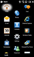
The default Windows homescreen is not really impressive to look at but may be quite usable in the end. It's a simple list of items, which you scroll up and down. What you may have missed though is that some of the items are side-scrollable too.
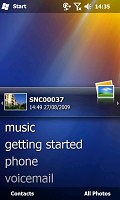
Some of the tabs available on the default Windows Mobile 6.5 homescreen
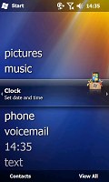
By scrolling sideways you gain access to different features associated to that item. For example a sideways sweep on the Getting started item lets you set the clock, email account, device password, Bluetooth, custom wallpaper, custom ringtone, upload music or even remove the Getting started item from the list once you're done setting up the device.
The getting started tab allows you to set up some of the basic feautures of the phone
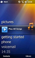
Another example is Pictures, where you get to browse the thumbnails of the photos in your gallery. Touching a photo opens it fullscreen in the photo album.
Tapping on the music tab will start the media player. We certainly hoped that the long outdated Windows media player will have its own set of updates but to no avail. Essentially, that makes whatever extra app the manufacturer has preloaded or you managed to download the better option.
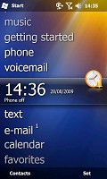
The Clock item provides information about the current time and date, and displays the operator logo. Tapping on Clock launches the default Windows alarms screen.
The Text and Email tabs display alerts about received messages and email, as well as give you one-click access to the message composer and the inbox respectively. You can scroll previous messages or other mailboxes by the usual side sweeping routine.
The Calendar tab monitors your appointments for the day and allows you to quickly set a new one. The today screen is the default calendar view, which gets displayed upon a press.
The final tab is reserved for the Internet Explorer Mobile favorites. Just as one might expect, a tap on any of the bookmarks will load it in the web browser. That web browser is one of the highlights of the new version of the OS but we'll be back to it soon.
The Honeycomb main menu
Pressing the Start menu icon in the top right corner no longer opens a drop down menu full of shortcuts. Instead it opens what we like to call the new Windows Mobile "Main menu". It's pretty much the same as the Programs menu in the previous version of the OS with few tweaks. It's got icons ordered in the oh-so-popular honeycomb pattern that many people must remember from numerous official and leaked screenshots.
The main menu and its submenus use the honeycomb layout
Microsoft claim that layout is easier on the thumb as there's more space around the item you'd be going for. So this main menu redesign is the next step towards dropping the stylus for good. And our experience showed that the final result is pretty nicely thumbable so no regrets there.
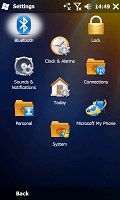
In the new main menu you've got icons for all the installed programs plus shortcuts to the settings menu (previously accessed separately from the now gone Start menu). That Settings menu has also received a facelift and displays icons in the same honeycomb structure.
The perfectly flat structure of the Main menu can surely get a bit clumsy in time due to the huge number of icons piling up (iPhone users with loads of apps installed will know what we mean). But we'd still prefer that over the confusing experience that so many new Windows Mobile adopters have had in the past. Besides, it seems to be the way things are moving with all other OS's so you'd better get used to it. Well it's either that, or Symbian which still sticks to its one-screen-fits-all layout.
Further on, all menus have a larger font that allows more finger-friendly operation. The close window key however still remains in the top right corner on quite a lot of occasions and even though it has been slightly enlarged is still not the easiest to press with a bare finger.
Another nice change brought by the new version of the OS is the option to alternate tabs screens (wherever WM offers tabbed screens) by simple finger side sweeps. You no longer need to aim for the tiny tab titles at the bottom of the screen as on the WinMo 6.1 handsets - you just sweep your finger across the screen and the next tab loads instantly.
Wrapping it up on this page, here is a quick demo of Windows Mobile 6.5 that we snatched from our Samsung I8000 Omnia II review for you to enjoy. Join us on the next page for even more details.
Tip us
1.7m 126k
RSS
EV
Merch
Log in I forgot my password Sign up