Talk to me
Motorola Moto X review: Talk to me

Stock Android user interface
Despite being developed entirely under Google's supervision the Motorola Moto X comes running Android 4.2.2 Jelly Bean out of box instead of the latest 4.3 release. Motorola have left the user interface mostly unchanged and the handset feels a lot like a Nexus smartphone.
You can see a quick rundown of the Moto X's UI in the video below.
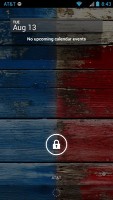
The lockscreen in Android 4.2.2 Jelly Bean features the same large dotted circle around the center-placed padlock button. Lockscreen widgets are present on the Moto X. They are full-screen, resizable tiles, one of which is always visible at the top of the main lockscreen, above the padlock icon. The rest are a swipe to the right away. The one on the main lockscreen is collapsed to make room for the padlock button, but can be expanded to display additional information.
There's a large variety of third-party lockscreen widgets and a few stock ones: Messages, Calendar, Gmail and Digital Clock. The camera shortcut, previously located at nine o'clock on the unlock circle is now a stand-alone widget, a swipe to the left away from the lockscreen.
Lockscreen widgets are resizable - tap and drag down to expand and show more content, if available. Lockscreen widgets can also be reordered by tapping and dragging, so you can choose which one is visible on the main lockscreen. They can also be dragged up to discard.
There are multiple unlock patterns to choose from: simple slide, pattern, pin or password, and face unlock. The lockscreen could even be skipped altogether.
Once unlocked, you're welcomed with the familiar homescreen interface introduced in Ice Cream Sandwich.
The dock is customizable and features two shortcut icons on either side of the app drawer key. You can have folders there, each with multiple shortcuts.
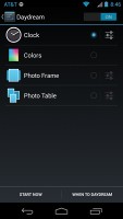
Android 4.2.2 Jelly Bean isn't just business and no play. Google's Daydream is a fun twist on the screensaver concept. Once turned on, you can set it up to show photo albums or the latest news from Google Currents when the device is either docked or idle.
In the notification center you'll find Quick toggles. They're accessible via an icon in the top right corner of the notification area. You get access to key device settings such as brightness, Wi-Fi, Bluetooth and Battery. Some toggles are directly accessible shortcuts to their respected functions in the settings menu.
The quick settings menu can be accessed by a two-finger swipe down from the top of the screen.
Google has added a bit of personalization to the Quick Toggle panel in the notification area. Your name and photo are displayed but only after you've logged in to Google+ or after you've manually set them yourself.
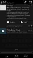
Notifications can be expanded and collapsed with a two-finger swipe, and the top one is expanded by default (if the app that put up the notification supports it, of course).
One of the major features which Motorola added to the Moto X is Active Display. It is on by default, and shows the time and the phone's notifications fading in and out when you take the phone out of your pocket. You can use the icons to go straight to the related apps from there.
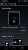
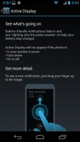
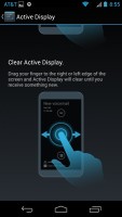
Active Display is really useful
The homescreen consists of five panes to fill with shortcuts, folders and widgets. More often than not, the latter are resizable in all directions in order to fit any tight space. To resize a widget, you tap and hold and then release. Four handles will appear on its sides, allowing you to change the widget's size in the direction you want.
Folders haven't been changed since Ice Cream Sandwich and function as you'd expect. A folder is created by dropping a shortcut on top of another and can be named by tapping on the "Unnamed folder" label. Opening a folder expands it only as much as needed to fit the icons inside.
The folders themselves are circular with the shortcuts inside drawn as if they are in a line One behind the other and you're looking at them at an angle (complete with perspective). They are lined up so the first shortcut in the folder will be the only one unobscured - the rest of the icons are nearly impossible to tell apart.


Resizing widgets • managing folders
The app drawer of the Moto X consists of four rows of icons. It features two tabs - Apps and Widgets, each with side-scrollable pages. If you scroll past the available apps you move into the Widgets tab. There's also a Market shortcut next to the tabs, for quicker access to Android's app repository.
Apps and widgets are ordered alphabetically and there's no other sorting option.
Placing a shortcut or widget on the homescreen works as you would expect: press and hold to grab it and then position it on the homescreen pane of choice. Two more options appear at the top of the screen while you're dragging - Uninstall (to quickly remove apps) and App info, which opens the application's entry in the Manage applications list. Drop the app or widget on either One to activate it.
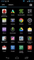
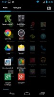
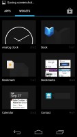
App drawer and widget selector
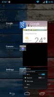
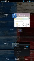
Last but not least, the Recent Apps list has remained virtually unchanged, save for some optimizations in load time and a few neat animations here and there. It all adds up as a really polished user experience and feels fantastic. It would be nice if Google adds a kill/close all option though.
As a whole, Android 4.2.2 Jelly Bean offers a polished and smooth user interface and runs nicely smooth on the Moto X. The OS is getting now offering more of the now-considered essential features which OEM skins like Sense 5, Nature UX and Optimus UI have been having for a while now, and it's interesting to see Google's spin on them.







Tip us
1.7m 126k
RSS
EV
Merch
Log in I forgot my password Sign up