HTC Sense 7 screenshots leak with Material Design in tow Comments
- AnonD-136279
- dZy
Unfortunately you are not the only one! ever since this crap "flat" and "simple" UI design, phones have become more and more boring and colorless.
Amazing how the better technology we get, the crappiest UI's come around. Starting from WP to iOS7 and to Android's... ugly doesn't even begin to summarize it...
But we are a minority, seems people like ugly.
- geo
- mZx
Why am the only one that thiks that this is too ungly? Where are the colors mixture and the beautiful icons and themes like sense 3.6 and 4.0?? Why all this greeny?? :(
- Anonymous
- Mfx
keke, 27 Oct 2014I did a lot of research before posting so the mass enjoys sense 6I don't doubt it. I was just commenting that, intentionally or not, you phrased that in a way that read "I hate it when companies do things their customers like"
- keke
- NrK
Anonymous, 27 Oct 2014"I detest it when mobile companies alters things without any mass complaints." So... moreI did a lot of research before posting so the mass enjoys sense 6
- Anonymous
- g54
AnonD-315011, 27 Oct 2014It's not sense 7 nor lollipop, first of all look at below link for app battery widget rebord ... more100%
- xz
- DN4
new stock android ui
- regs
- x1n
AnonD-315011, 27 Oct 2014It's not sense 7 nor lollipop, first of all look at below link for app battery widget rebord ... moreGood catch. Moving youmobile into untrusted sources.
- AnonD-315011
- aXx
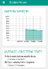
It's not sense 7 nor lollipop, first of all look at below link for app battery widget rebord
https://play.google.com/store/apps/details?id=net.hubalek.android.apps.reborn.pro&hl=en
2nd the software number still stuck on 3.xx, it should be on 4.xx
and 3rd is buttons, lollipop buttons are circle, triangle and squire not this kitkat buttons!!!
someone just fool around with some sanpshots of app and do a photoshop job on versions
- Anonymous
- au{
ilove sens is best
- Itta
- n}u
For me it's doesn't look like material at all it look like HOLO design and it looks terrible compared to stock Lollipop.
- kamikazi
- HI4
cool,
still waiting on my n4 :)
- jandurek
- 0BH
Material Design? Where? The screenshot on the left looks almost the same as older Sense versions (except different versions and green color) and the screenshot on the right is Battery Widget Reborn 2.0.x.
- AnonD-30760
- vbR
Second screenshot is from app battery widget reborn I believe !
- rails
- fBh
Why I mostly feels google follows HTC.. well HTC already been using those bold colors from Sense 6 and also look at google play music which is a lot similar to Sense Music player app. Anyways Sense 6.0 was also very enticing adding more material design will make it even better. and if Google apps could be ported to android kitkat they would have looked great on HTC as Google apps and HTC apps now have same design so it would be more consistent all over..
- Anonymous
- Mfx
keke, 27 Oct 2014Nothing is wrong with Sense 6 I detest it when mobile companies alters things without any mass... more"I detest it when mobile companies alters things without any mass complaints."
So... you hate change that people like? How curious...
- AnonD-274519
- pWQ
Anonymous, 27 Oct 2014you can change the colours as you wish haterFortunately, that's a good thing.
- M8
- TSN
similar to Battery Widget Reborn.
- Anonymous
- pqC
AnonD-274519, 27 Oct 2014Green looks ugly. The current Sense 6 looks much better.you can change the colours as you wish hater
- AnonD-227172
- pVQ
HTC bring back Sense 4+ and the widgets.
htc is becoming vanilla day by day. why the hell we'll buy HTC? we better buy Nexus instead if we get boring User interface. same goes to LG and Samsung. where the hell the fancy went? where is the eye candy?
Tip us
1.7m 126k
RSS
EV
Merch
Log in I forgot my password Sign up