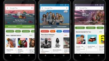
Google Play Store to get a major redesign Comments

- lol
- YUf
i wish they allow more countries to access apps with in-app purchases.............
- AnonD-351867
- jQk
well I wish they re-design youtube and play music, they 2 app are absolutely terrible
- AnonD-416130
- teq
Anonymous, 16 Oct 2015I removed Google Play Store and Google Play Services and dont use them anymore because they ov... morewhole point of buying an android based phone is to use google services , you better off with windows phone or maybe even iPhone
it should with without any slow downs unless you have a 256mb ram or similar :)
- dexterouz
- sSJ
Still love Play store changes. I have iPad mini, though App Store looks good but the way Play Store present worldwide rating and reviews are so useful. The statistics, similar apps, preview video its very useful and easy to use.
- AnonD-416130
- teq
AnonD-347427, 16 Oct 2015What's wrong with google they copied the windows phone store designed .what ?
- AnonD-387110
- fqx
Still ugly
- AnonD-347427
- vGy
What's wrong with google they copied the windows phone store designed .
- envy165
- rJw
Play coming to windows 10 mobile....awesome ...
- Said
- mH6
AnonD-47808, 16 Oct 2015huge copy of windows 10 mobile store :d scared much google ?Yeah it looks very similar to windows 10 mobile store. Google copies everyone.
- Anonymous
- p2I
I removed Google Play Store and Google Play Services and dont use them anymore because they overuse system resources and make phones tablets slower.
- AnonD-47808
- XNp
huge copy of windows 10 mobile store :d scared much google ?
- Anonymous
- T6r
Funny how all people writing here are the same ones that complain when a single pixel is changed on a website and go into a coma every time the whole UI is changed.
- Anonymous
- Mfx
Anonymous, 16 Oct 2015Just so you know, it's more natural to have rounded buttons, the touched area on the screen wi... moreIt should also be noted, round icons were also traditionally harder to do before screen resolutions got high enough to do convincing curves on pixel-based monitors. Just look at anything fifteen-twenty years ago, especially mobile device screens, and see the visible steps on the edge of anything "rounded".
- Anonymous
- Mfx
Just so you know, it's more natural to have rounded buttons, the touched area on the screen with your finger is also round. That's why Apple also insists on having most buttons round. Simple logic that simple folk don't understand.
- AnonD-362866
- NHU
Android UX. Lmao biggest joke of the decade lol.
- Gibby
- Ixj
Oh dear
Whatever happened to the phrase 'If it ain't broke...'
Rounded icons look childish and amateur - almost apple-like. They look like something designed circa 15 years ago. Whatever happened to the square flat material design concept.
Another 'make-work' project - graphic designers justifying their existence! :S
- AnonD-397942
- tuf
U said ugly,i think its beautiful.......i hope their release the update :)
- AnonD-434087
- Jky
Ugly rounded buttons... But it's ok, not a big deal.
- Anonymous
- u7Y
The new UI is just awesome....very much excited to get the update..!!

Tip us
1.7m 126k
RSS
EV
Merch
Log in I forgot my password Sign up