Here's our first look at the Android 12 redesign Comments
- M
- 3SL
Funny how Apple brought widgets last year, and now Android ripped them off after already doing widgets for so long.
- Anonymous
- r3H
Is everyone gonna pretend iOS doesn’t already have all these, even better with colored icons, no need for ugly notifications, IOS works on things that matters. Life ain’t about specs
- Anonymous
- nYE
Anonymous, 09 Feb 2021The first few seconds I was wondering why someone out iOS screenshots in there... seems lookin... moreForgot to mention, this looks more like iOS and Samsung skin got a baby, and took over the ugliest parts of what both have to offer.
Typical Google style, I miss the times when android looked more "logical" than what they present now here.
- Anonymous
- nYE
The first few seconds I was wondering why someone out iOS screenshots in there... seems looking at it second time cleared that up for me and I had to facepalm.
So even more waste of space, 4 toggles in the notification shade compared to 6 I have now, is one of many issues I see in these screenshots.
- AmeliaBuns
- 33p
I wish they'd instead work on making different android forks like Samsung's UI and all that crap more smooth and have better animations, and improve things like software updates and stability. and also work on performance and all. it's just the last few versions of android don't really bring much. I wish android was more like iOS in some ways! I don't like iphones because apple can be annoying at times, but at the same time i miss their fluid software.
- Zion45
- r3H
We have most of this on one ui 3.. every time its like google just copying Samsung one ui again and again
- Jk19
- fCI
I don't understand, most devices still run on Android 10, barely anyone launched with 11, and here is posting for 12. While I m typing with 9.
- FarFan
- 3Rh
It looks like 3 interns work on developing android platform and none of them actually uses android phones
- AAdmiral
- TX{
Omen471, 09 Feb 2021What phone are they testing it on? The next Pixel? Nah, think it's a Samsung if you see the holepunch camera
- AnonD-975260
- 6mM
I like this direction that G started to improve privacy features. I hope they continue
- Anonymous
- 7k0
Am I the only one thinking that by copying iOS, they ruined the visually appealing design of the previous versions but added everything that iOS does wrong?
- Anonymous
- CbC
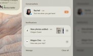
Not related to the phone but having F.R.I.E.N.D.S characters names in it is funny... Such as Rachel, Monica etc...
- OS Lover
- KZK
Icon wise, it's look similar to MIUI and One UI. While the the overall UI had DNA from iOS and MIUI(Which of course is the overall UI was "borrowed" from iOS as well, LOL)
On side note, the beige color look kinda classic and sad in my opinion though, with a touch of nostalgia. Overall I had no complain on the UI update (In fact they had long overdue for a revamp on the stock UI anyway), just hope that the biege color would change to white or light grey.
- Avinash
- DkW
It looks cool
- Ahxen
- JFB
To be very honest I am happy with android 11 but this 12 looks strange.i don't like the icons of that.
- Robi
- uvI
Miui update iss better than this 😏
Tip us
1.7m 126k
RSS
EV
Merch
Log in I forgot my password Sign up