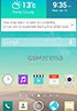
EXCLUSIVE: LG G3 screenies show new Optimus UI, QHD res Comments
- AnonD-77322
- 0UX
what a cheap copy of samsung's round buttons in the notification at LG....
- Blaze135
- LAC
I had the Optimus G and was amazed at how similar (for lack of a better word) was in UI looks, settings and features to the GALAXY S III which I had as well. This is that very same thing ALL OVER AGAIN.
- AnonD-190733
- rJV
way better than 3.0
- AnonD-114814
- mKb
wow, 22 Apr 2014such samsungNow the Samsung fanboy to spit on your phone
- AnonD-118519
- pTi
TouchWiz, is that you??
- AnonD-256796
- fvY
simple and awesome .
- bah
- nwc
more rounded childish theme
- AnonD-239347
- uv0
Still ugly.Doesn't matter if they go flat with interface icons look & feel still doesn't have a wow factor.
- antonioli
- P4T
It's ok. I expect that the system is clean too.
- Anonymous
- pF7
QHD for 5.5 inch? Too much.
- wow
- SX$
such samsung
- Gabriel Oliveira
- Jpe
The notifications part seems still gingerbread feels they need change it.
- arjun
- ut@
why arent OEMs trying to provide better updates or useful camera functionality or something else.. they waste time desigining this UI's .most of the users use 3rd party launchers after a few days.. waste of resources and time by OEM's..
leave coustomising ui's offer better services and user experience and optimization for the hardware..
- Anonymous
- th6
I fins the old optimus ui to be very annoying. The new one looks very good.
- hungacsokesz
- n}e
I like it, hope it will be available for the g2 mini, and the others.
- AnonD-151027
- MNF
Please LG , dont be Samsung
- Anonymous
- Ixt
ugly
Tip us
1.7m 126k
RSS
EV
Merch
Log in I forgot my password Sign up