Midnight oil
Amazon Kindle Fire review: Midnight oil

User interface
The Kindle Fire OS is based on Android, but you rarely get a glimpse of anything familiar - like the mini settings menu that pops up at the bottom of the screen in some apps. It is a forked version of Android - using the open source code but not licensed by Google, meaning you don't get native Google apps and the Android Market.
The OS has been styled completely to Amazon's taste, with most of the Android features cut off. The end result is simple and straightforward - in line with the Fire's main purpose of giving you one click access to Amazon's content. There's also a tinge of disappointment at what the tablet could've been capable of with a fully-fledged version of Android .
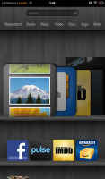
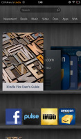
The Kindle Fire's homescreen just couldn't have been more basic. Under the Search bar and Categories, you get a virtual bookshelf with all the content you've accessed or stored.
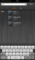
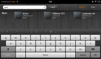
Search and the Kindle Fire keyboard
At the top of the homescreen, there are seven categories below the search bar: Newsstand, Books, Music, Video, Docs, Apps and Web. Tapping on any of them will take you to the dedicated app or relevant content catalog.
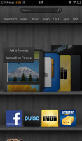
Further down, a Cover Flow-like scrollable 3D list of icons, called the Carousel, features all the items you've accessed recently. It is generated automatically and can get a bit messy as it fills up with shortcuts of varying size and shape to everything you've opened recently. It could be anything: media files, books, webpages, apps, docs, etc. The good thing is, the latest software version lets you remove items from the Carousel.
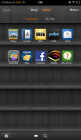
Below the Carrousel is the Favorites section. Essentially, you can pin anything to the homescreen for quick access - a book, an entire album or a single song, an app, a document, a webpage, etc. There is no limit of the number of items you can place on the homescreen. Extra rows are added to the bookshelf as you add shortcuts.
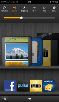
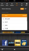
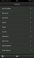
Just like on every other Android device, the Amazon Kindle has a status bar at the top, which expands into a notification are and some quick settings. In the Kindle Fire it's split in two. A tap in the right corner, near the status indicators, will pull down the settings: a few quick toggles for autorotation lock, volume, brightness, Wi-Fi, Sync and More. If you tap on More you'll be taken to the full settings menu.
To expand the actual notification area, you need to tap near the device's name.
There have been only a few software updates for the Kindle Fire so far and many users report improved speed and overall handling. We obviously have no idea about how the Fire felt at launch, but it isn't anything particularly impressive performance-wise running the latest software. We wouldn't call it slow but scrolling and zooming could've been a tad smoother.
Simple contact management
The Contacts app is resembles the Android 2.3 Gingerbread's phonebook but isn't that powerful. It displays all the contacts in a list ordered alphabetically and there is an alphabet bar on the right. It's not a scroll this time, you must tap on the letter you want instead of scrolling through them.
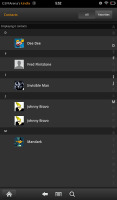
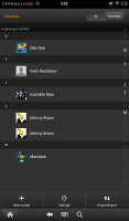
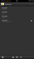

Contacts app • viewing a single contact
There are only two options at the bottom of the phonebook - Advanced options and Search. The shortcut to the Favorite Contacts is at the top right corner.
Each contact is displayed with a contact photo and name. No Quick Contact functionality is available though.
There is no tabbed interface when viewing a single contact. All the stored information is displayed in one page.
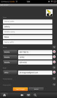
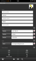
The available fields when editing a contact are Name (5 fields), Phone, Email, Postal Address and Organization. Of course, you can add more than one phone, email, etc.


Tip us
1.7m 126k
RSS
EV
Merch
Log in I forgot my password Sign up