Nothing Phone (4a) review
Design, build quality, handling
Looking at the back of the Nothing Phone (4a), one might say, "Well, sure, it's not your everyday phone, but it's just a Nothing phone with a semi-transparent back," and while that is true, it is also kind of the point. The Nothing Phone (4a) manages to remain unique while also unmistakably a Nothing product. That's the kind of design language coherence we like to see and very much appreciate.
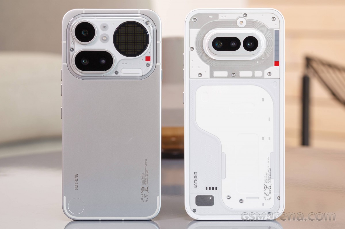 Left: Nothing Phone (4a) Pro • Right: Nothing Phone (4a)
You might even go as far as to say that with its horizontal camera island, the Phone (4a) looks like a textbook A-series Nothing phone. That would be true as well, and also a big achievement on the design front. Making things that are similar yet different can be challenging.
Having said all that, while it is undisputable that the Nothing Phone (4a) looks different that pretty much every non-Nothing phone out there, its appeal remains entirely subjective. In our personal experience, you either very much enjoy what Nothing is doing design-wise or you dislike it thoroughly. There is very little in between.
We are sure the Nothing design team is well aware of that fact, and seemingly it hasn't dampened the experimental spirit one bit. Looking a bit closer at the Nothing Phone (4a), we can see that the camera island, while familiar in overall shape, has been moved up quite a bit and also has a new surface and edge design. It is now colored in silver, as opposed to the black backing on the Nothing Phone (3a). This hardly stands out at all on the while color option, but does on the other colorways.
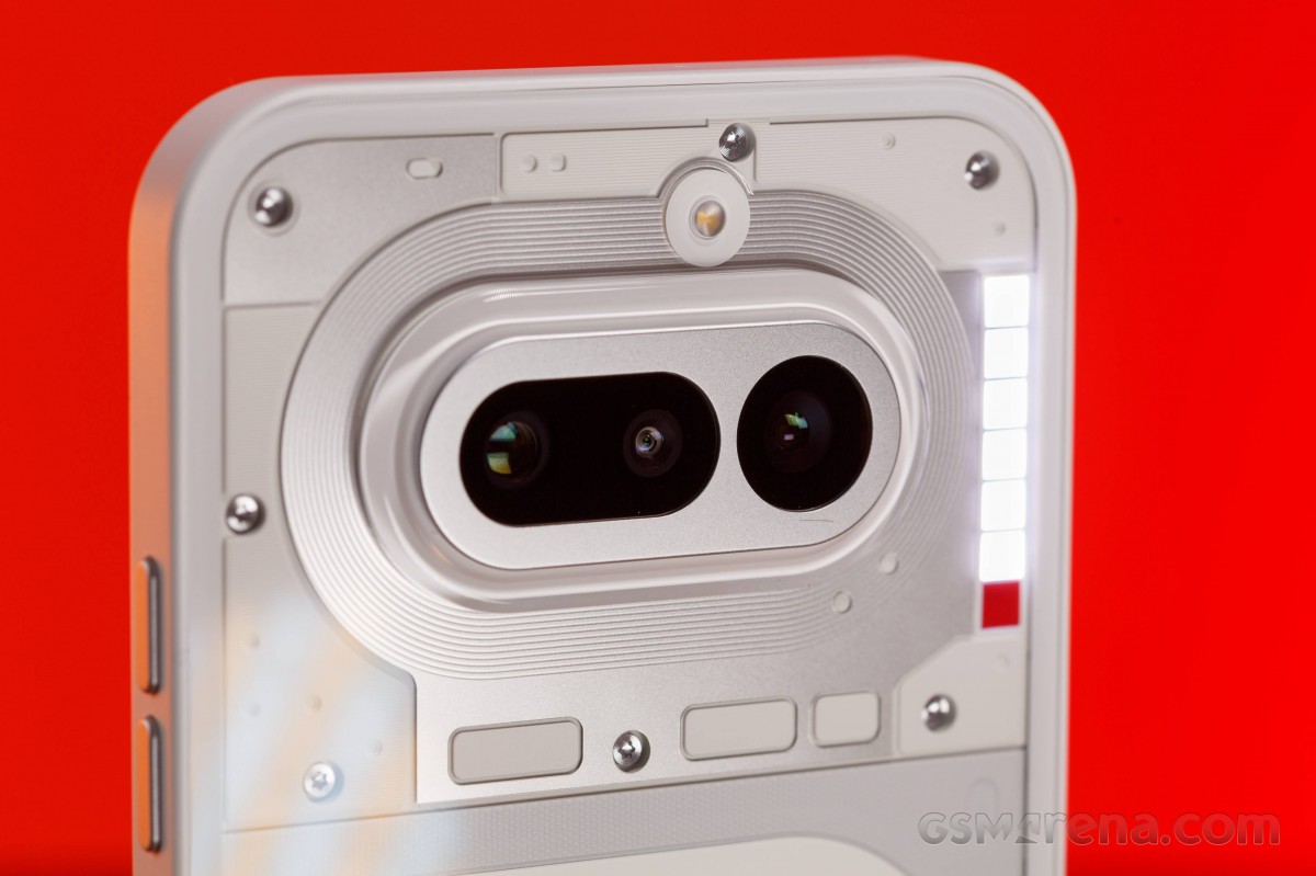
Speaking of colors, the Nothing Phone can be had in Black, While, Blue or Pink.

Circling back to the design, as per usual, the semi-transparency is entirely orchestrated for design sake. All of the shapes and little "modules" visible under the back glass are intentionally put there for show and Nothing more. Well, except for the Glyph Interface, which is very much a functional part of the design.
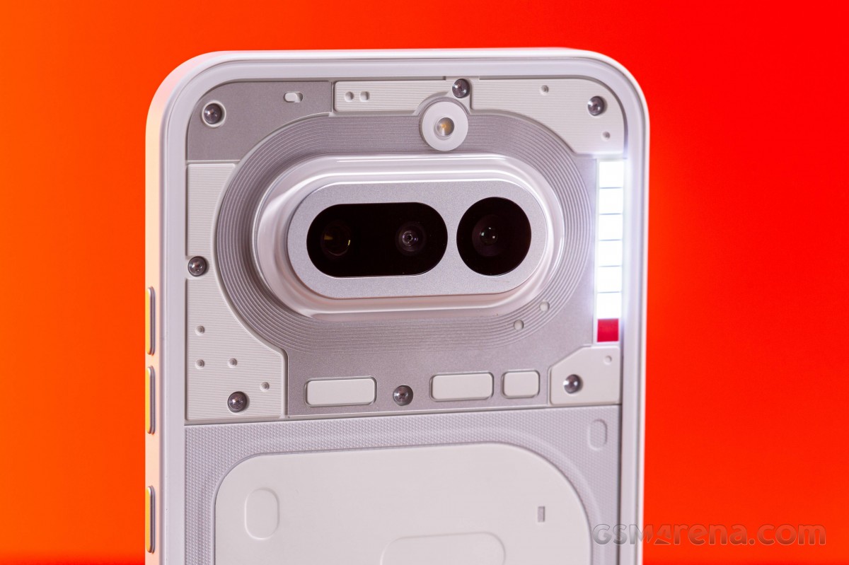
In this iteration, Nothing calls it the Glyph Bar, which makes sense since it consists of six vertically-arranged segments sitting to the right of the camera island. Well, actually, seven segments, if you count the bottom-most one that lights up while the camera is recording video. Underneath the six segments, there are actually 63 LEDs, so there is much finer control over lighting zones than the segmentation on the surface would suggest. Also, Nothing says that the LEDs are 40% brighter on the Phone (4a) compared to last year's model and can reach 3,500 nits.
If you've never encountered a Nothing Glyph Interface, it is actually quite nifty. You can adjust the LED intensity in three levels and make it react to various events like incoming calls and notifications. The Glyph Bar can also be used as a volume indicator, as a timer, including countdowns in the camera app and as a visual indicator for the phone's flip to mute optional feature. Nothing even has a few third-party app integrations you can play around with that use the Glyph as a progress indicator.
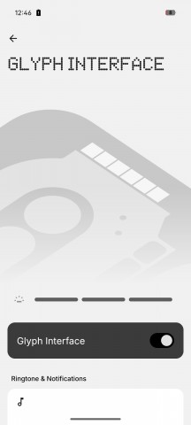
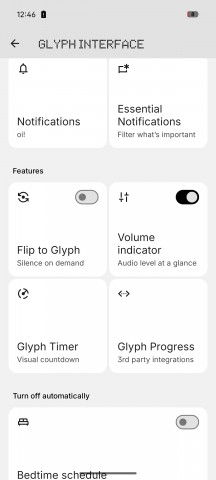
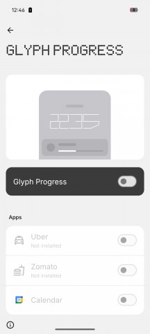
Glyph Bar features
While we are on the topic of more exotic controls, the Nothing Phone (4a) also has the Essential Key, sitting lonesome on the left-hand side of the frame. It's an interesting concept from Nothing. The main idea behind it is to offer a "richer" and AI-infused screenshotting experience as part of a daily organization tool.
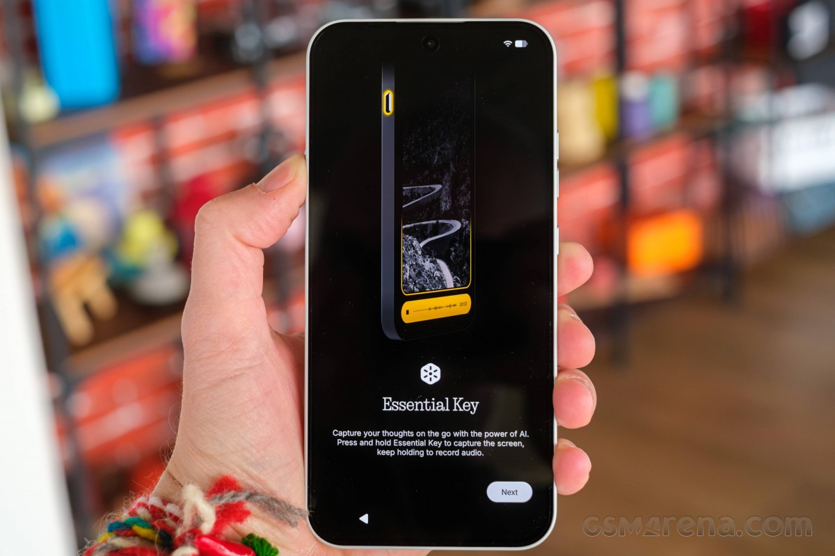
The way Nothing envisions things is for the user to keep track of certain things throughout the day, either by pressing the Essential Key once to capture a screenshot or holding it down to also record a voice memo to go along with the screenshot. Then all of the images and audio are analyzed and grouped into the Essential Space. It's a bit like having a personal assistant to organize things like appointments and tasks for you.
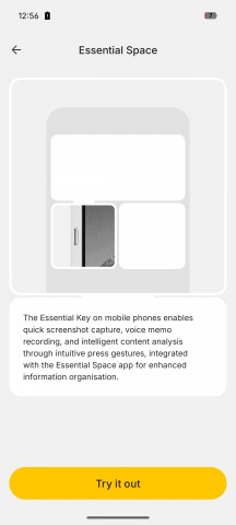
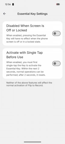
Essential Space and Essential Key
The rest of the controls on the Nothing Phone (4a) are pretty bog-standard. You get two separate volume buttons on the right-hand side and a power button beneath them. All are well-positioned and nicely responsive and tactile. The bottom has a grill for the main speaker. An amplified earpiece up front handles the other channel. Also, on the bottom - the SIM tray, Type-C port and the main microphone.
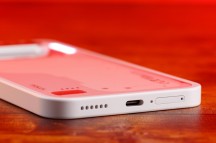
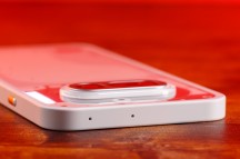
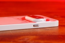
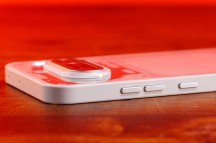
Nothing Phone (4a)
There is a nice little rubber gasket around the SIM slot, which is encouraging, especially given the ingress rating situation. Frankly, we aren't quite sure what the deal is since Nothing sort of offers their own "manufacturer-rated" figure of up to 20cm of fresh water resistance for up to 25 minutes, but the European standardized regulatory label that came with our review unit clearly states IP64. We guess both are true.
In terms of materials, you are looking at plastic for the middle frame. That's not quite as premium as the aluminum the Nothing Phone (4a) Pro gets, but it's still plenty structurally sound, it's lighter and gets the benefit of being color-matched with the rest of the body. Plus, Nothing says the Nothing Phone (4a) is 34% more bend-resistant than the Nothing Phone (3a).
As per Nothing, the Phone (4a) also has the smallest carbon footprint (51.13 kg) out of any Nothing Phone. It achieves that partially through using recycled materials in 30 of the components throughout the phone, including plastic, steel, aluminum and tin.
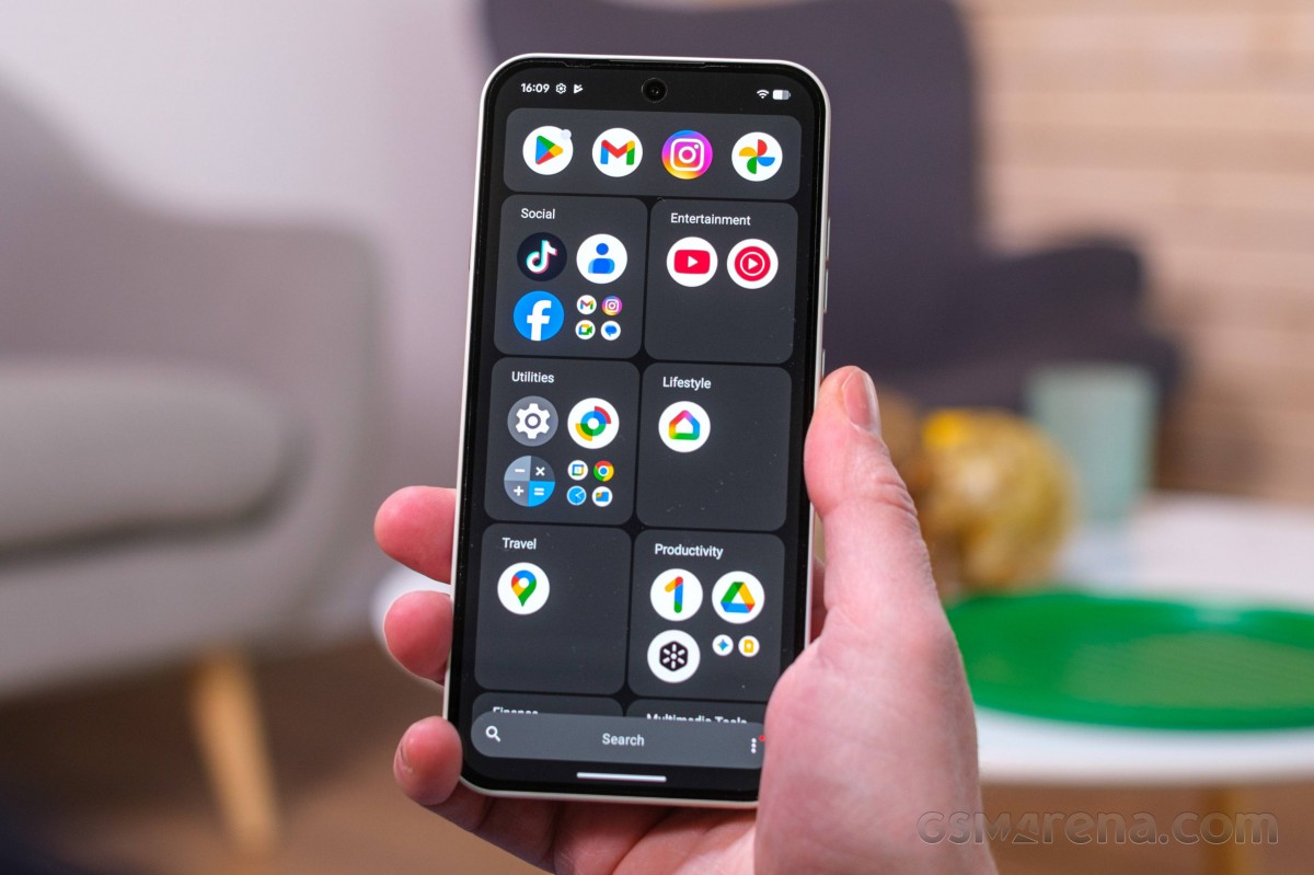
An undisclosed type of hardened glass covers the back, while the front gets a Gorilla Glass 7i protective layer. Not too shabby at all.
Finally, the front features a clean and modern design. The display sits entirely flat and flush with the frame. The aggressively rounded corners with a deep curve make for a sleek and trendy look, especially when combined with the otherwise flat and wide sides.

Nothing might be doing its own thing when it comes to back design, but the rest of the phone is definitely keeping up with current trends. There are no visible sensors anywhere on the front of the phone. Everything is nicely tucked away under the display.
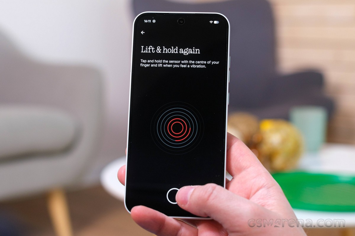
That includes the optical under-display fingerprint reader. It is fast and accurate. We have no complaints with it.


Tip us
2.1m 180k
RSS
EV
Merch
Log in I forgot my password Sign up