Fan favorites
Google Nexus 4 vs. Samsung Galaxy S III: Fan favorites
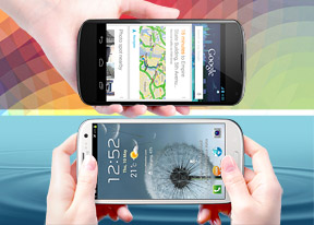
User interface - stock vs. custom
Android is the chameleon of the smartphone world - each version gives you a base set of features and makers are free to build on it however they like. This is pretty clear when you look at the Google Nexus 4 and the Samsung Galaxy S III.
While both run Jelly Bean - 4.2.1 in the case of the Nexus and 4.1.2 for the Galaxy - they look and feel different, not to mention have different features and skills.
Before we dig into the details, check out our quick hands-on videos to see both phones in action:
The lockscreen is the first thing you see. The Galaxy S III used to have one of the most customizable lockscreens - you can put shortcuts there, an info ticker (for news, stocks or Facebook), a dual clock and weather info.
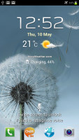

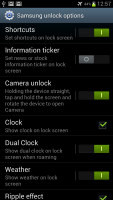
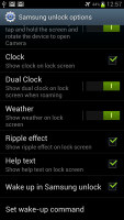
The Samsung Galaxy S III lockscreen and options
Google topped that with JB 4.2 - they introduced widgets to the lockscreen. So, you can have all the functionality that the S III offers and more. There are some limitations though - the S III piles all the info on one screen, while the stock 4.2 lockscreen shows only one widget at a time. Also, there are only three widgets available by default, though you can grab new ones from the Play Store. And finally, you only get two shortcuts - camera and Google Now (a third-party widget can easily fix that).
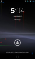
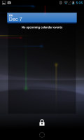
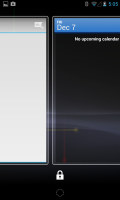
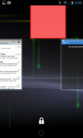
The new lockscreen in Android 4.2 has widgets
We really like what Google did with the lockscreen on Android 4.2, but we're not so sure about the new toggles in the notification area. They cover the basics - screen brightness and auto-rotation, Wi-Fi and Bluetooth, cell signal strength and airplane mode, battery info and a settings shortcut.
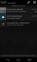
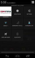
Standard notification area • new area with more options
That's great but the Wi-Fi and Bluetooth icons are just shortcuts to the respective settings screen, not power toggles. And the brightness shortcut brings up a slider, so to change the brightness you need to do a two-finger swipe, tap the icon and then set the brightness to the desired level.
Samsung's custom power toggles in the notification area are quicker - they turn, say, Wi-Fi on and off on a tap and bring up the settings on a long press. The brightness slider is right there, so that's one click less to set. Also, keeping both toggles and notifications in the same place is simpler and it makes sense on a 4.7-4.8" screen.
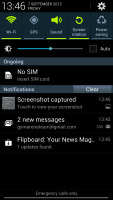
Samsung chose to keep it all in one place
Android 4.2 changed nothing about the homescreen, so the Nexus 4 brings no surprises - 5 homescreens, a fixed Google search bar on the top, four customizable shortcuts in the dock. The drawer holds both app shortcuts and widgets separated into two tabs.
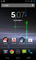
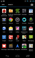
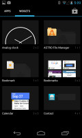
The 4.2 homescreen • the app and widget drawer
Samsung's approach with the Galaxy S III is quite similar, though, again, it offers more customization options. You can have up to 7 homescreens (and less than 5 if you like) and you can easily rearrange them. The drawer uses a tabbed layout for both shortcuts and widgets, but allows you to hide apps and switch to an alphabetized grid, a custom grid or a list.
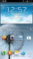
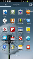
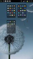
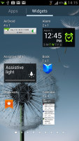
Samsung's TouchWiz homescreen is similar but with more options
Keep in mind that both the lockscreen and the launcher (which is the homescreen + drawer) can be replaced with a 3rd party app, so you're not tied to a particular combo if you buy the Nexus or the Galaxy.
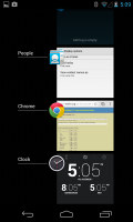
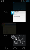
One thing that the launcher can't change - with anything but a custom ROM - is the task switcher. The Nexus 4 uses a vanilla switcher accessed from the on-screen button. It's a thumbnail list of recent apps that you can swipe to terminate.
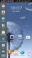
Samsung uses the same switcher (accessed upon a press and hold of the Home key) with a little twist - there are three buttons at the bottom, which launch the Task manager, Google Now or clear all apps.
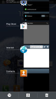
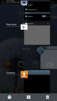
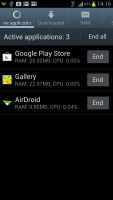
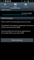
Samsung has added three buttons to the task switcher • one of them leads to the task manager
Another way to access Google Now is a long press on the Menu key. On the Nexus 4 you press and hold the on-screen Home key and drag (similar to the unlocking gesture). The S III has Samsung's S Voice (double tap the Home key), which has mostly been superseded by Now though it can still do a couple of things that Now can't - e.g. toggling Wi-Fi on/off or snapping a photo.
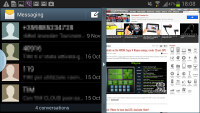
Anyway, the latest update to the Samsung Galaxy S III brought something that Google has not yet implemented (though it's certainly being considered) - MultiView. It runs two apps side by side for the ultimate multitasking, and the powerful quad-core processor makes it look so easy.
Only supported apps work with MultiView (root users have ways to get around that), but the list is quite comprehensive - Browser and Chrome, Gmail and Email, SMS app, Talk and ChatOn, Facebook, Gallery, Video player and YouTube, Maps and Polaris Office. The Music player is not supported (though there are controls for that in the notification area).
The two apps you pick will split the screen in half by default, but you can drag the divider to adjust it at any time to any position. There are also two buttons that allow you to swap the windows or expand one of them full-screen (essentially turning off MultiView).
MultiView greatly improves multitasking - for example you can chat with someone while browsing, without having to constantly switch between apps. Or you could chat with two people at once. Or edit a document while keeping some reference material in the browser. There are many possibilities - especially now that Samsung has published the API and third-party apps can join in.
Even splitting the screen to watch a video while doing something works better than using the Pop Up Play feature, which floats the video window around (that's more of a "look at what quad-core can do" feature than a useful one).
Winner: Samsung Galaxy S III. We love what Google did with the lockscreen, but everywhere else the Galaxy S III was more customizable and had more features.


Tip us
1.7m 126k
RSS
EV
Merch
Log in I forgot my password Sign up